 When it comes to your website, you have to wonder what it says about you. Your web design must be something that promotes your brand effectively. From the content to the visuals, everything needs to be on point. It is our job at Visibility to ensure your site reaches its full potential.
In 2020, one thing that will make or break your company is the way you design your website. We aren’t simply talking about looks though. It is also important to consider how it functions and how easily people can navigate it. Articles out there will tell you what to do. However, the problem is that not every piece of advice may apply to you. Fortunately, we are here with some of the leading design mistakes you need to avoid in 2020.
Tell users everything
Your website must tell users what the company does and why they should pick you straight away. Arguably, the greatest offender is failing to do this. The reason why is that user opinion typically forms in .05 seconds. You could do everything else correctly. However, if a user fails to make a justified choice on your site, they will hit the back button. This is more likely if they are in the B2B sector. Around 46% of buyers shall leave instantly if you don’t make it clear what the business is about.
Short load times are key
Don’t allow your website to take longer than 3 seconds to load either. It’s true that individuals get impatient whilst offline. When they are online though, it is much worse. Everyone expects websites to load quickly. Roughly 47% of people want them to load within 3 seconds. This figure goes up to 53% for mobile users. As a result you need to ensure your web design allows the fastest loading possible.
The right font sizes
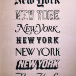 Fonts can’t be very small or hard to read. In fact it is wise to make sure they are reader-friendly in general. Some individuals will probably recall squinting to read a website’s text. It is not good and no one really has time for this.
Difficult to read text is actually one of the most frequently recurring web design mistakes. Body text should ideally be over 14px. You should also put all body copy in Sans Serif font to make it user-friendly over multiple devices.
Too many links
The website also can’t have an abundance of links that open new windows. This is the first step towards a terrible user experience. It also welcomes users to leave the site. Another negative is that opening several browsers at once makes navigation troublesome. They eat the bandwidth up as well. This shall slow the users’ machine down and spoil the online experience.
Social media icons
One final and common mistake websites make is having their social media icons at the top of the page. This welcomes users to leave and encourages distractions at the same time. When someone leaves a site for social media, they often end up in a scrolling rabbit hole. They could never return to your site from this. Place them at the bottom, middle, or side.
Give Visibility a call to talk about web design
At Visibility, we design sites by considering everything from the client’s unique selling points to their industry. The one thing we make sure we avoid doing is making the site another standard copy of something else. Your site should have its own feel and sell your brand.
If you would like to speak to us about web design, feel free to get in touch. We can create any kind of site for you, from a large ecommerce shop to a small showcase one.